
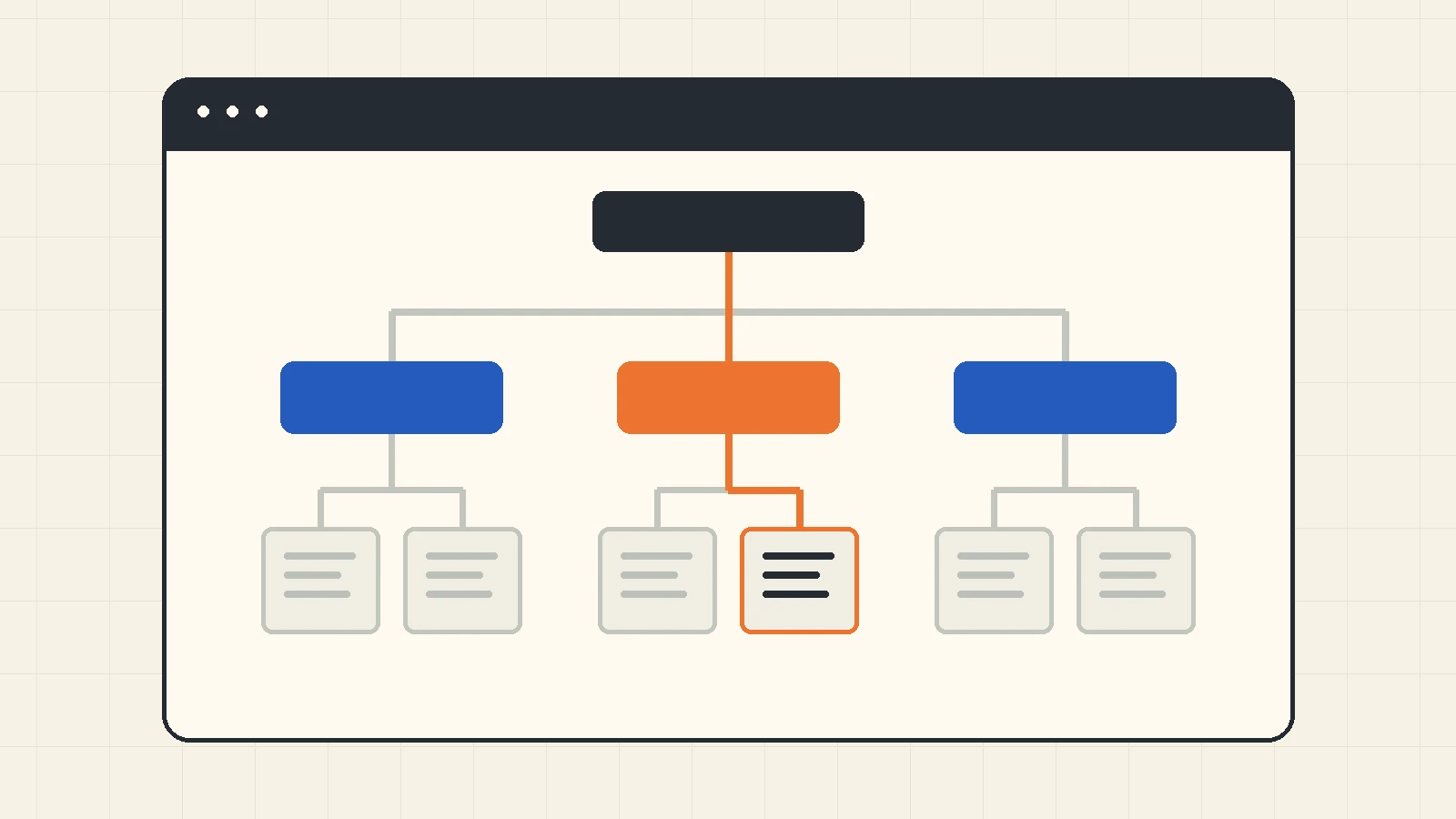
B2B website navigation should connect a buyer’s question to a clearly named section and a useful destination. Start with tasks and existing pages, propose categories and labels, test where people expect to find information, then verify the actual desktop and mobile menu. A tidy header is only one part of that work.
This guide is for a B2B marketing team planning or revising a service website’s navigation. It provides a task map, a hypothetical hierarchy, a research sequence and a release worksheet. The examples are editorial proposals, not results from a client test. For the wider redesign decision, start with the pre-redesign website audit.
On this page: Map buyer tasks · Choose categories and labels · Test the proposed hierarchy · Check menu behavior · Use the acceptance worksheet · Common questions
Map B2B website navigation to buyer tasks
Before choosing a menu layout, write down what a visitor needs to find. A technical evaluator may need compatibility details; an operations lead may need to understand the work involved; a purchasing colleague may need a useful route to the next conversation. Treat those as candidate tasks to validate with the people the site serves, rather than assuming every visitor follows the same sequence.
Inventory the real destination pages next. Record each canonical URL, its primary question, the information currently available and any unresolved content gap. A menu label cannot make a thin destination useful. If several pages answer the same question, resolve ownership before making each one a separate menu entry. The B2B website strategy framework covers that upstream decision.
Use a simple task-to-destination record. The following prompts form our proposed planning method; they are not requirements from a search engine or a usability standard.
- Buyer question: What does the person need to understand or do?
- Destination: Which existing page actually answers that question?
- Entry label: What wording would make that destination predictable?
- Evidence: Which query, interview observation, support request or content review supports the choice?
- Uncertainty: What still needs testing before the label is accepted?
For example, “check whether a maintenance service covers our equipment type” is a more useful planning task than “visit Solutions.” The first describes an information need; the second repeats a menu label and assumes the answer. Separate the task from the proposed route so your research can reveal a different expectation.
Choose categories, labels and a navigation template
Decide what each navigation layer does. Our editorial approach is to use the global menu for the principal information families, section navigation for related detail, utility links for recurring functions, and contextual links for the next question within a page. This creates a reviewable purpose for each link without forcing every destination into the header.
Compare candidate groupings against the task map. A product-oriented group may fit an established catalog; an application-oriented group may help someone who knows the problem but not your terminology. If both routes are useful, they can point to a shared destination. Two menu paths do not require two near-identical pages.
A hypothetical industrial-service menu
This is a starting hypothesis for an imagined equipment-maintenance business, not a prescribed CHCZ menu or a verified industry pattern. Retain a section only when the business has the relevant offering and supporting content.
- Services: equipment maintenance; inspection; technical support.
- Applications: production-line maintenance; facility equipment care. These pages explain the relevant task and link to the applicable service.
- Technical resources: compatibility information; preparation guide; terminology guide.
- About: verified company and team information.
- Contact: a clear route to explain the equipment and the question.
- Utility area, where applicable: existing-customer support and language selection.
Test whether “Applications” is understood by the intended audience. “Industries” or “Equipment types” may be a better candidate if those distinctions reflect how people actually look for help. Document the distinction between Services and Applications on their landing pages. When reviewers cannot explain why a page belongs in one group, the label or grouping still needs work.
Use labels that describe the destination rather than internal team names or unexplained branded phrases. Review neighboring labels together: an individually clear term can still overlap another category. Keep an explicit route for someone who already knows what they need, while providing useful detail for someone still researching.
There is no menu-item count proposed as a release rule here. The practical decision is whether the actual set is understandable and operable at the tested widths. A dropdown, expanded panel or simple row is a candidate interface; choosing its visual style does not settle the underlying categories.
Test grouping separately from the visual menu
Nielsen Norman Group’s card-sorting guidance describes a method in which participants organize labeled items into groups. Use it when you need evidence about how people categorize the information. Offer content descriptions that people can understand, and record uncertain items as well as repeated groupings. A staff brainstorming session can produce hypotheses, but it is not a substitute for research with the intended audience.
Once you have a proposed hierarchy, tree testing evaluates where participants expect to find resources within categories, without the full visual interface. Write tasks that describe the needed information without revealing the category label. Define the acceptable destination before running the task. This is different from asking whether a finished header looks attractive.
For the hypothetical service site, candidate tasks could be: find whether a particular equipment type is supported; find what information to prepare before requesting help; find the route for an existing support need. Select tasks based on the real site’s scope. Avoid inventing a destination that the organization has not agreed to provide.
In our proposed decision record, retain the task wording, tree version, intended destination, first category selected, final destination, backtracking and the participant’s explanation. Use the results to distinguish a label problem from missing information. If people find the intended page but still cannot answer the question, adding another menu route will not fix its content.
Agree on what would justify a revision before comparing alternatives. With a small qualitative study, report observed confusion and the sample context; do not turn a handful of sessions into a population claim. A team review without participant research should remain labeled as an untested hypothesis. Then test the selected structure in the rendered interface, because a text-only hierarchy cannot establish touch or keyboard usability.
Verify the actual desktop and mobile navigation
W3C WAI’s Menu Structure tutorial recommends meaningful menu structure, identification and labeling. It also calls for consistency across screen sizes: items that are shown should retain their order, wording and destination. Compare the same buyer task on desktop and mobile rather than reviewing each screenshot in isolation.
Separate a destination link from a control that opens a submenu. The WAI fly-out tutorial covers keyboard operation and alternatives for reaching submenu content. If a parent category also has a useful landing page, make the behavior understandable rather than asking one ambiguous interaction to perform both actions.
The WAI-ARIA disclosure navigation example explains why ordinary site navigation does not necessarily use the ARIA menu role. It is an illustrative pattern, not production-ready code. The selected implementation still needs testing with the relevant browser and assistive technologies.
- Closed and expanded states: Can the person recognize the menu control, open it and understand which group is expanded?
- Keyboard path: Can they reach the controls and destinations, see focus and leave the navigation? Record the actual sequence and any blocked state.
- Touch and scrolling: Can they expand a group and select its destination without an overlay obscuring the needed content? Check longer labels, not just the shortest one.
- Orientation: Can they identify the current section after following a link? Verify the visible state and the programmatic information.
- Language: Does each published language retain meaningful wording and valid localized destinations? A translated label alone does not establish a correct route.
For destinations, Google Search Central’s link guidance recommends crawlable anchors with an href and descriptive link text. Inspect the rendered links as well as clicking them. Menu controls that only expand a group have a different job from links that lead to a public URL. Use the internal linking audit for a detailed source, anchor and target inventory, and the accessibility checklist for the wider buyer journey.
Copy a navigation acceptance worksheet
Keep one record for each priority task and the menu version tested. This worksheet is CHCZ’s proposed operational method. Fill it with observed evidence, leaving unknown fields open rather than marking a task successful because the link exists.
- Task and audience: the information needed and who is trying to find it.
- Starting condition: entry page, language, viewport, browser and input method.
- Expected route: proposed category, label and canonical destination.
- Content check: the information the destination must contain to answer the task.
- Research evidence: study or review date, participants or reviewers, hierarchy version and observed choices.
- Rendered evidence: steps, open/closed states, actual target, focus and a useful capture of any problem.
- Decision: retain, relabel, regroup, repair interaction or fill the content gap; state why.
- Owner and acceptance: who makes the change, who reviews it and how the same task will be retested.
Keep category research and interaction defects in separate fields. For instance, a person choosing an unexpected category may suggest a hierarchy issue; a correctly chosen destination that cannot be activated from a keyboard suggests an interaction issue. Those observations call for different work. Neither by itself proves a commercial outcome.
When releasing a change, retain the previous menu version and confirm its routes can be restored. A label or placement change can often keep the existing destination URL. If a proposal also changes URLs, handle that as a migration decision rather than quietly bundling it into menu styling. Assign review ownership before changing a shared component.
After release, observe the affected paths with comparable tasks and conditions. Clicks show use of a control, not whether the destination answered the question. Record inquiry quality separately from menu activity, and account for other concurrent content or campaign changes before interpreting movement. The worksheet should preserve uncertainty, not turn an interface change into an unsupported performance story.
B2B website navigation: common questions
Should a B2B site organize its menu by services or industries?
Choose the structure that helps the intended audience find its information. Services can suit people who know the offering; an application or industry route can support a different starting question. Test both labels against real destinations. Keep a shared canonical page where the answer is the same, rather than creating duplicate content for every route.
Is a mega menu necessary?
Choose a menu pattern after the categories and destination map are clear. A larger panel may expose a complex hierarchy, but its value still depends on understandable groups and operable controls. Compare it with a simpler arrangement on the actual task, desktop and mobile states. Visual space alone is not acceptance evidence.
Does improving navigation establish an SEO or inquiry gain?
Navigation can provide clear, crawlable routes to useful pages. A released change still needs separate observation of discovery, search behavior and inquiry quality. Retain the prior structure and the dates of other changes. Passing a route or usability check establishes that tested condition; it does not establish a ranking or revenue effect.
Make the next route testable
Start B2B website navigation work with one unresolved buyer task and its destination. Use the worksheet to propose a category and label, identify the missing evidence and test the actual route. Explore the B2B Website Strategy cluster for related decisions. If the team needs help defining the scope, bring the task map and open questions to CHCZ.
Evidence note: Sources were checked on 10 October 2026. W3C WAI and Google documentation support the technical statements; Nielsen Norman Group explains the research methods. The task map, sample hierarchy and acceptance worksheet are editorial proposals. No participant study, site-specific outcome or first-hand implementation result is claimed.