
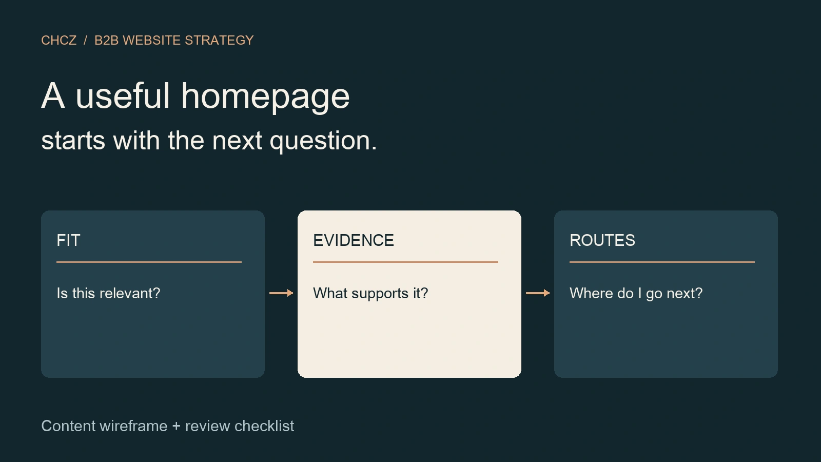
Give the homepage a bounded job
A B2B homepage should help a visitor recognize the offer, judge whether it fits, find credible supporting information, and choose a useful next destination. It introduces the company’s range; detailed service scope, product specifications and inquiry requirements belong on the pages that own those decisions.
This guide is for business owners and marketing teams preparing a homepage brief. Use the content wireframe and review record below to decide what goes on the page before choosing visual treatments. The recommended order is a starting hypothesis: change it when research shows that a different question comes first.
Nielsen Norman Group’s homepage design principles emphasize explaining the organization’s purpose, exposing useful content and supporting onward navigation. Visitors can also arrive on an interior page and return to the homepage to orient themselves. Your homepage therefore needs to work as a return point as well as an entry point.
Write the homepage brief before the hero
Write down the offer category, priority audience, useful outcome and next destination. An internal phrase such as “integrated excellence” leaves too much interpretation to the reader. A concrete category tells the reader what kind of organization they are evaluating; a fit statement narrows the situations it serves.
- Offer: What does the company actually provide?
- Fit: Which buyer situation should recognize itself here?
- Evidence: What approved material supports that description?
- Route: Where can the reader inspect details or ask a relevant question?
Keep the brief tied to the actual business. If the offer or audience is unsettled, resolve that decision with its owner. Homepage copy should express an agreed position, rather than invent a new capability to make a headline sound stronger. Use the broader B2B website design strategy framework when these upstream decisions are still unclear.
A B2B homepage design content wireframe
Use this matrix to turn the brief into sections. It specifies the question and the required input, rather than prescribing a fixed number of cards or a particular visual style. Combine sections when they answer the same question; omit a section that has no useful content.
| Section | Buyer question | Input to prepare | Next destination |
|---|---|---|---|
| Orientation | What do you offer, and is it relevant? | Approved offer description and a fit boundary. | Relevant product or service overview. |
| Offer routes | Which option should I explore? | Distinct descriptions of the main options. | One existing owner page per route. |
| Supporting evidence | Why should I consider this claim? | Permitted material with clear scope. | Full documentation or evidence. |
| Working approach | What would using this involve? | A concise explanation of inputs and dependencies. | Method or preparation guide. |
| Useful next action | What can I do now? | A clear action label and destination. | Relevant inquiry or further research route. |
Put evidence beside the question it answers
A general credibility strip is not a substitute for support near a material claim. If the homepage introduces a technical capability, place an approved product illustration, specification excerpt or method explanation beside it, with a route to the complete material. A logo alone does not explain the scope of a relationship or the work performed.
Prepare an evidence record for each proposed item: the statement, the supporting material, permission to use it, its scope, its owner and its review date. If evidence is missing, narrow the wording or leave the claim out. Do not fill an empty proof block with an invented endorsement, borrowed result or implied certification.
Choose images for the information they convey. A useful process diagram can explain a sequence; a product photograph can show a relevant feature. W3C’s image alternative decision tree distinguishes informative, decorative and functional images. Decide the image’s purpose before writing its alternative text, and keep essential meaning available as real page content.
Route different buyers without duplicating the menu
The menu provides persistent access to the site. Homepage content can explain why a destination is useful. For a company with several offers, use short, distinct descriptions so a buyer can compare routes without opening every page. Avoid giving different cards the same generic label and the same destination.
Group routes by a distinction a buyer can recognize: product family, application or problem, for example. Use role-based routes only when readers understand the labels and the destinations genuinely differ. A technical evaluator and a purchaser may need different evidence about the same product; that does not always require separate pages.
Link to existing canonical owners. Google’s link guidance recommends standard anchor elements with an href and descriptive anchor text. Use clear destination names in the content brief, then check the rendered links. The navigation task-mapping guide covers menu structure and route testing in more detail.
Worked example: a hypothetical technical supplier
Suppose a fictional supplier provides components for industrial equipment. Its homepage draft contains a full product catalogue, a long company history and a contact form before explaining which applications the components serve. The problem to investigate is whether a buyer can find the relevant product family and its supporting information.
A revised content plan could introduce the component category and intended applications in the hero, show the main product families with distinguishing conditions, link each family to specifications, and offer a clearly described technical inquiry route. Company background stays available through a deeper page. This is a proposed content sequence to test, not an observed business result.
Give a likely buyer a realistic task: “Find the component information you would need before asking about fit.” Record which route they choose, what they expect to find, and where the wording creates uncertainty. Revise the confusing section, then repeat the task. Do not turn one successful walkthrough into a conversion forecast.
Review the working homepage, not just the mockup
Review the actual copy, media and destinations at mobile and desktop sizes. A short placeholder can conceal a wrapping problem or an unclear message. Check the reading sequence, headings, image meaning, keyboard access, visible focus and the route back from deeper pages. W3C’s page structure tutorial explains how meaningful regions and headings support navigation.
Use a record that separates the observation from the decision:
- Section and task: What was the visitor trying to understand or reach?
- Test context: Which page, language, viewport and input method were used?
- Observation: What happened, including unexpected destinations or missing information?
- Decision: Keep, revise or investigate; name the owner and evidence needed for another check.
A completed design review does not establish business performance. After release, compare the relevant homepage-to-detail routes and independently verified inquiries with the site’s own baseline. Avoid attributing every inquiry to the homepage merely because the visitor saw it.
Common B2B homepage questions
How long should a B2B homepage be?
Use the length needed to establish fit, expose useful evidence and make the next routes clear. Move detailed evaluation material to its owner page. If a section repeats information without helping a decision, combine or remove it. Test whether readers can find what they need instead of imposing a universal word count.
Should the homepage have only one call to action?
Give the page a clear primary next step, while retaining useful routes for visitors who need more detail or already use the product. Keep the labels and purposes distinct. A homepage serving several audiences has a different job from a focused campaign landing page.
Is the homepage a substitute for service pages?
No. The homepage introduces the range and helps visitors choose. A dedicated service page explains a particular offer’s fit, inputs, outputs and supporting evidence. Use the homepage to make that deeper information discoverable, rather than repeating the entire service page.
For the related planning tools, visit the B2B Website Strategy cluster. To discuss an unresolved homepage brief, share the buyer question and the current page with CHCZ.